I really enjoyed this article on mixing typefaces over at Hoefler & Frere-Jones. It’s true what they say – a lot of times, mixing typefaces is truly an intuitive process. Many times, my clients (brides, specifically) comment on how they like the use of contrasting fonts. That’s the beauty – to me – of what I do. Typefaces you can’t find just on any computer, used in an exciting, eyecatching manner. What separates a graphic designer from anybody with a computer, you ask? An understanding of the way type works and the right ways to use it.
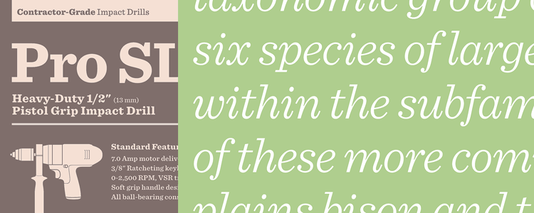
Type specimens from H+F-J:

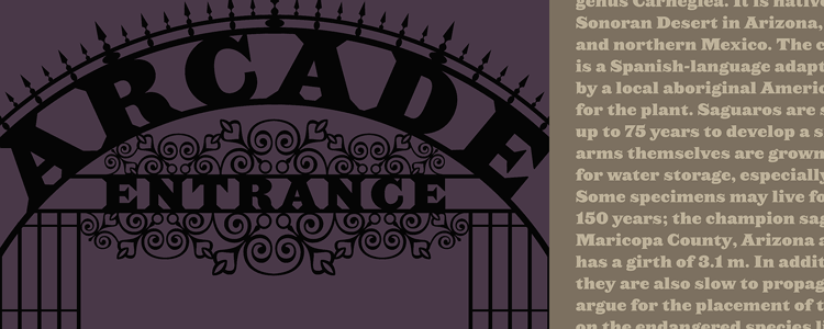
Hoefler&Frere-Jones have way too many typefaces that I would like. I’m still crushing on Archer.
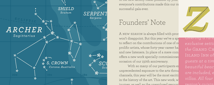
And I might be falling a little bit in love with Proteus.
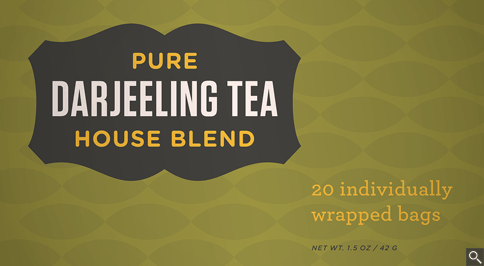
Sentinel – the italic is particularly lovely to me.
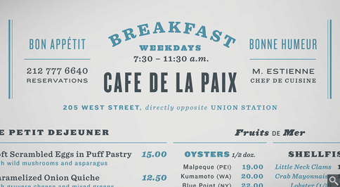
And Knockout –

I need to be saving my pennies. This could get expensive.